
A customer can decide whether a property feels established before they ever reach the front door. Long Island monument signage puts your name, location, and brand directly in that decision-making moment. For medical offices, retail centers, schools, places of worship, apartment communities, and professional buildings, the right monument sign makes the entrance easier to find and harder to forget.
This is not a sign category where a generic panel and a few vinyl letters will do the job. A monument sign is a permanent visual asset. It needs to work with your architecture, hold up through Northeast weather, meet local requirements, and remain readable from the road. The payoff is substantial when it is planned correctly: stronger curb appeal, better wayfinding, and a more credible first impression every day.
What Makes Monument Signage Different?
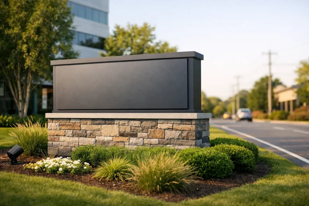
Monument signs are freestanding structures installed at ground level, typically near a driveway, street entrance, or property line. Unlike a pylon sign, which sits high on poles, a monument sign has a lower profile and a more grounded appearance. It can be faced with masonry, aluminum, acrylic, wood-look materials, stone veneer, or architectural panels to match the property it represents.
That low profile is a strength, but it also creates a design challenge. Drivers have less time to read a sign near the ground, especially on busy roads. The message must be immediate. Your business or property name should lead, while logos, tenant names, directional details, and service information need a clear hierarchy.
For a multi-tenant building, a monument sign may include a directory cabinet with changeable panels. For a healthcare practice, it may focus on a clean logo, address, and illuminated lettering. A school or church may need an electronic message center for announcements. The best format depends on what visitors need to know before they pull in.
Start With the Road, Not the Artwork
Many sign projects go off course because design begins with colors and fonts instead of visibility. A great-looking proof on a computer screen can become an unreadable blur from across a four-lane road.
Before fabrication begins, evaluate where drivers approach from, their typical speed, the distance from the road, landscaping, nearby signs, and the angle of view. A sign facing a slow-moving parking lot entrance can carry more information than one facing fast traffic. If trees, utility poles, parked vehicles, or street furniture block the view, placement may matter more than increasing the sign’s size.
Letter height should be based on viewing distance, not personal preference. Thin scripts, tightly packed copy, and low-contrast color combinations usually create problems. Your logo can still have personality, but the primary identification needs to be bold enough to perform in real conditions.
A useful test is simple: if someone unfamiliar with the property has to slow down, squint, or circle back to understand the sign, the design is not doing its job.
Give the Sign One Clear Job
A monument sign can welcome visitors, identify your location, direct traffic, promote tenants, or share changing messages. Trying to do all of those things equally often creates clutter.
Decide on the primary job first. A retail plaza may prioritize tenant visibility. A doctor’s office may prioritize confidence and easy navigation. An apartment complex may prioritize a polished residential identity. Once that purpose is clear, the design team can organize information so the most important message is always seen first.
Materials Should Match the Property and the Maintenance Plan
Long Island properties deal with rain, snow, wind, salt exposure in coastal areas, UV light, and routine wear from landscaping equipment. Material selection is not just about appearance. It affects lifespan, maintenance, and the total cost of ownership.
Aluminum and high-performance architectural panels offer a clean, modern finish and resist corrosion well. They are a smart fit for medical offices, retail properties, and contemporary commercial buildings. Dimensional acrylic letters can add depth and a polished look, particularly when paired with an illuminated background or halo lighting.
Brick, stone, and masonry finishes give monument signs weight and permanence. They work especially well for residential developments, schools, campuses, and properties with traditional architecture. The trade-off is that these structures can require more extensive foundations, longer installation timelines, and more coordination than a straightforward fabricated cabinet.
Wood-look materials can create warmth for hospitality, parks, community organizations, or certain retail concepts, but the finish must be selected carefully for outdoor durability. The right look is only valuable if it continues to look intentional after several seasons outside.
There is no single best material. The winning choice is the one that supports your brand, budget, building style, and maintenance expectations without sacrificing legibility.
Lighting Extends Your Sign’s Working Hours
If customers arrive before sunrise, after work, or during winter evenings, illumination deserves serious attention. An unlit monument sign can disappear precisely when visibility matters most.
Internally illuminated cabinets provide strong, consistent nighttime visibility. Push-through acrylic lettering can create a refined, dimensional effect, while halo-lit letters cast light behind the lettering for a more architectural finish. External gooseneck or landscape lighting is another option, especially for stone-faced signs where an illuminated cabinet would not suit the design.
Each lighting method has different costs, visual effects, and maintenance needs. Internal LED illumination is efficient and highly visible, but it may not fit every property aesthetic. External lighting can look premium and understated, but fixtures need to be positioned to avoid glare and dark spots. A professional site review prevents a beautiful sign from becoming a poor nighttime performer.
Long Island Monument Signage Requires Early Planning
A monument sign is often tied to site conditions, municipal rules, landlord requirements, and installation logistics. That makes early planning a major advantage. Waiting until the building is finished or the business is about to open can limit your options and create expensive rush decisions.
Local sign regulations can affect height, overall square footage, setback from the road, illumination, electronic message displays, and permit requirements. Properties with multiple tenants may also have branding standards or lease restrictions. A sign partner should review these practical constraints before finalizing a concept, not after materials have been ordered.
Installation is equally important. Monument signs may require concrete footings, electrical service, excavation, structural engineering, and coordination with property managers or local agencies. Underground utilities and drainage conditions need to be considered before crews arrive. This is why a low upfront price that excludes planning and installation can become costly later.
For Long Island monument signage, the strongest approach is a complete process: assess the site, develop a design that performs from the road, select durable materials, manage approvals, fabricate accurately, and install professionally. That approach protects the investment and keeps responsibility with one accountable team.
Design for the Brand You Want to Become
A monument sign should reflect more than what your business sells this month. It should support where the organization is headed over the next several years.
If your brand is growing, avoid filling every inch with temporary messages or overly specific service claims. Build around a strong logo, memorable colors, and clear property identification. If tenant turnover is likely, include a directory system designed for efficient updates instead of rebuilding the entire sign each time a suite changes hands.
Consistency matters beyond the monument itself. The colors, typefaces, and finishes should connect with building signs, lobby graphics, parking directions, window graphics, and interior wayfinding. When every touchpoint looks coordinated, customers feel that the operation is organized and trustworthy.
10X Sign Company helps businesses and property owners manage that full scope, from initial concepts and custom fabrication through professional installation. The goal is not simply to put a sign at the entrance. It is to create a visual asset that earns attention and makes arrival easier.
Common Mistakes That Cost Visibility
The most expensive monument sign mistake is treating it as an afterthought. Other frequent problems include using too much copy, choosing colors with weak contrast, undersizing the primary text, ignoring nighttime visibility, and selecting materials that fight the building’s architecture.
Another common issue is neglecting the surrounding landscape. Mature shrubs can cover a sign’s lower half. Tall plantings may look attractive at installation but create sightline issues as they grow. Plan the sign and landscape together, then establish a maintenance routine that keeps the message visible.
A monument sign is one of the few brand investments that works around the clock at the exact point where customers make decisions. Give it the same strategic attention you give your storefront, website, or customer experience, and it can keep producing results long after the installation crew leaves.