
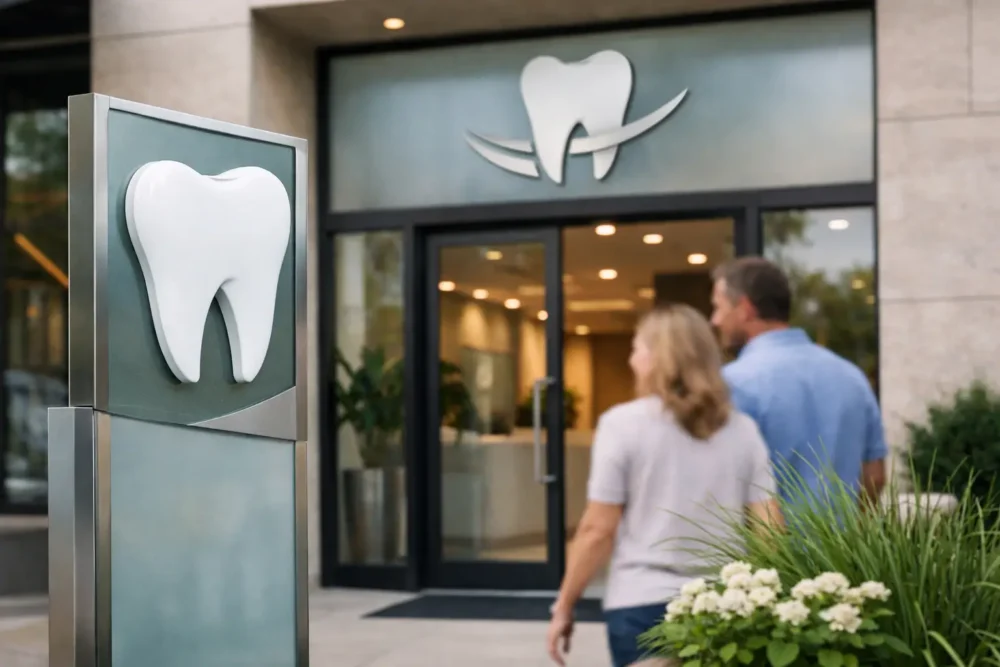
A patient may decide how they feel about your practice before they speak to a receptionist. They notice whether the entrance is easy to find, whether the logo looks current, and whether the office feels organized from the sidewalk forward. A dental signage makeover turns those small visual signals into a stronger first impression – one that supports patient trust, reduces confusion, and helps your practice stand out in a crowded local market.
For dental offices, signage is not simply a name over the door. It is part of the patient experience. The right combination of exterior signs, window graphics, lobby branding, ADA signs, and wayfinding creates a professional environment that tells patients they are in capable hands.
Start With the Patient Journey, Not Just the Sign
The best dental signage makeover begins with a walk from the parking area or sidewalk to the treatment room. Look at the experience through a first-time patient’s eyes. Can they spot the practice from the street? Is the correct entrance obvious? Can a parent carrying a child, an older patient, or someone arriving late find the reception desk without stopping to ask for directions?
Many practices focus first on an exterior logo sign. That matters, but it is only one part of the system. A bright, polished channel letter sign can improve visibility after dark, while window graphics can clarify your services, hours, or accepted insurance messaging. Inside, a lobby sign establishes the brand, and directional signs guide patients to check-in, restrooms, operatories, and exits.
When every element works together, the office feels intentional. When it does not, patients see a mix of faded decals, handwritten notices, generic directories, and inconsistent colors. Even excellent clinical care has to work harder to overcome that visual disconnect.
What a Dental Signage Makeover Should Solve
A successful update should solve specific business and patient-experience problems. Start by identifying the friction points. Perhaps new patients drive past the office because the building sign is too small. Maybe the suite entrance blends into a busy medical plaza. Or your office has grown, added services, changed ownership, or refreshed its logo while old signs remain in place.
For a dental practice, the most valuable signage improvements often address four areas:
- Street visibility that helps prospective patients find the practice quickly
- Professional branding that reinforces a calm, modern, trustworthy image
- Wayfinding that reduces late arrivals and front-desk interruptions
- Accessibility and compliance needs, including clear ADA signage where required
There is a direct operational benefit here. Clear signage means reception staff spend less time giving directions. Patients arrive with more confidence. Your office looks more established in photos, online listings, and social media posts. These details support the reputation you work hard to build chairside.
Choose Exterior Signs for Visibility and Context
The best exterior sign format depends on your building, landlord requirements, sightlines, street traffic, and local rules. There is no one-size-fits-all answer. A storefront practice on a busy Queens commercial corridor needs a different approach than a dental suite inside a professional building in Manhattan or a freestanding office on Long Island.
Channel letters are often a strong choice when you need a premium, highly visible identity. Individually illuminated letters create dimension and can remain readable well into the evening. For a practice located above street level, a projecting sign or window graphics may be more useful because they catch the attention of people walking along the block.
An awning can work well for offices with a sidewalk-facing entrance, combining shade, building presence, and branded visibility. A custom light box sign may be the practical choice for a plaza, retail center, or location where illumination and clear readability are the priority. Monument signs can give freestanding practices a permanent, established presence, especially when multiple providers share a property.
Material selection matters. Low-cost signs may look acceptable on installation day but fade, crack, or lose their finish under weather and UV exposure. A sign partner should recommend materials based on location and lifespan, not just the lowest initial price. That is how you avoid paying twice for a sign that should have lasted.
Keep Exterior Messaging Focused
Your main sign should make the practice name easy to read at a glance. Do not crowd it with every procedure you offer. A smaller secondary sign, window graphic, or door decal can communicate practical details such as general dentistry, cosmetic dentistry, emergency appointments, phone number, or office hours.
Use plain language. Patients searching for a dentist do not need a wall of clinical terminology before they walk inside. They need to know they found the right place and that the office is open, welcoming, and professional.
Make the Lobby Work Harder
Once patients enter, the lobby should confirm the confidence created outside. A custom lobby sign behind the reception desk gives the space a clear focal point. Options such as dimensional letters, acrylic panels, metal finishes, or illuminated logo signs can be matched to the personality of the practice.
A pediatric dental office may choose brighter colors, friendly shapes, and graphics that help children feel at ease. A cosmetic or implant-focused practice may benefit from a refined palette, clean typography, and higher-end materials. Neither approach is automatically better. The right choice is the one that matches your patient base, office design, and positioning.
Interior signs should also be practical. Room identification signs, restroom signs, staff-only notices, and treatment-area directions must be easy to understand. If your office serves multilingual communities, consider whether bilingual or multilingual signage would make arrivals and navigation easier. In neighborhoods across New York City, that small decision can make a meaningful difference in how accessible the practice feels.
Use Wayfinding to Reduce Patient Stress
Dental visits can create anxiety, especially for new patients, children, and those coming in for complex treatment. Signage cannot replace a warm team, but it can eliminate avoidable uncertainty.
Wayfinding is most effective when it appears before patients need it. A suite directory at the entrance, clear arrows in a shared hallway, identifiable floor numbers, and a visible check-in sign prevent the awkward moment when someone is unsure where to go. If parking is available, directional signs can help patients move from their car to the office without calling the front desk.
The design should be consistent. Use the same logo, colors, typography, and visual hierarchy across exterior and interior signs. A patient should not wonder whether the sign in the elevator hall belongs to the same office they saw from the street.
Avoid overdesigning wayfinding. High contrast, readable type, and sensible placement beat clever graphics every time. A directional sign is successful when people follow it without thinking about it.
Plan for ADA Signs and Building Requirements Early
ADA signs are a key part of a professional dental environment, particularly for permanent rooms and accessible routes. Requirements can affect tactile lettering, Braille, mounting height, contrast, and placement. Building management may also have rules for exterior signs, suite signs, directories, illumination, and installation methods.
This is why a signage makeover should be planned before a new office opens or a renovation reaches its final days. Waiting until the last minute can cause delays, rushed design decisions, or signs that need to be replaced because they do not meet site requirements.
A full-service sign company can review the project scope, recommend appropriate formats, fabricate the signs, coordinate installation, and remove outdated graphics or signs as needed. For busy practice owners, that is far more efficient than assigning design, production, permits, installation, and disposal to separate vendors.
Refresh Without Losing Recognition
A makeover does not always mean a complete rebrand. If your practice already has local recognition, the goal may be to sharpen what works instead of starting over. You can keep the familiar logo while improving legibility, updating colors, adding illumination, and replacing worn materials.
This approach is especially useful for established dental offices. Patients still recognize the practice they have trusted for years, but the updated signs signal momentum and attention to detail. The office looks current without feeling unfamiliar.
If you are changing the name, adding partners, or expanding into a new location, create a sign plan before ordering individual pieces. Decide what patients need to see at the street, building, entrance, lobby, and treatment areas. That plan prevents mismatched signs and helps you invest where visibility will produce the best return.
Turn Your Office Into a Stronger First Impression
A dental signage makeover is one of the most visible upgrades you can make to your practice. It supports marketing, improves operations, and gives patients a more confident path through your door. The strongest projects balance appearance with function: bold enough to be found, polished enough to inspire trust, and clear enough to make every visit easier.
If your current signs no longer represent the quality of care your team provides, do not let them keep speaking for your practice. Bring the full patient journey into focus, from the first street-level glance to the final step out of the office. A well-executed signage plan gives your practice a presence patients can recognize, navigate, and remember.