
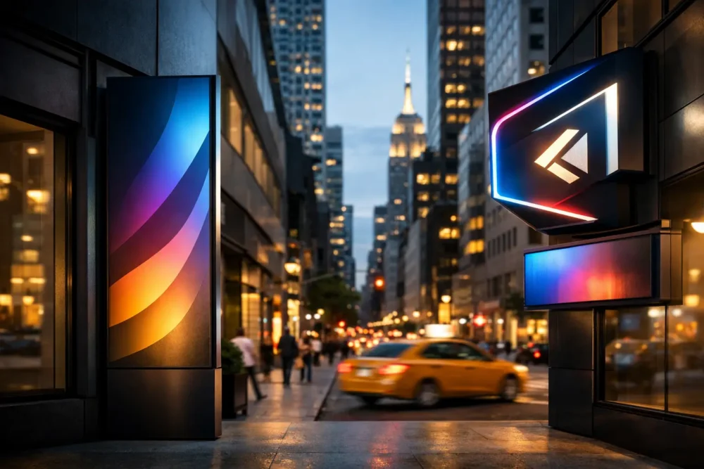
A storefront has only a few seconds to earn attention on a busy Queens avenue, a Brooklyn retail corridor, or a Manhattan block. That is why signage design trends 2026 are less about decoration and more about making brands easier to spot, understand, and remember. The strongest sign programs combine visibility, clear messaging, durable fabrication, and a look that holds up after the opening-day excitement is over.
For business owners, the real question is not whether a trend looks good on a mood board. It is whether it helps customers find the entrance, trust the business, and take the next step. Here is where sign design is moving in 2026 – and how to apply it without wasting budget on short-lived ideas.
Signage Design Trends 2026 Put Visibility First
The biggest shift is practical: signs are being designed as part of the complete customer journey. A channel letter sign may bring someone to the storefront, but window graphics, door decals, lobby signs, directional signs, and point-of-sale messaging must carry the experience forward.
This matters especially in dense commercial areas, where customers make fast decisions and may be seeing your business for the first time from across the street. One excellent exterior sign cannot solve a confusing entrance, a blank storefront window, or an unmarked suite directory. In 2026, smart businesses are building coordinated sign systems rather than ordering isolated pieces.
Illuminated letters with more control
Illuminated channel letters remain a top choice because they work day and night. The design trend is moving away from lighting every surface at maximum brightness. Front-lit, halo-lit, and combination-lit letters are being selected based on the building, neighboring businesses, viewing distance, and local conditions.
Halo-lit letters, for example, can give a law office, medical practice, salon, or professional service business a refined presence. Front-lit channel letters may be the stronger choice for a restaurant or retail location that needs bold visibility from traffic. The right answer depends on your brand and sightlines. A beautiful sign that disappears at night or gets washed out by surrounding lights is not doing its job.
Dimensional materials that create depth
Flat printed signs still have their place, particularly for temporary promotions and large-format messaging. But dimensional signage is gaining ground for permanent branding. Acrylic, aluminum, PVC, metal laminate, routed panels, raised letters, and layered elements create shadows and depth that photographs cannot fully capture.
This is a valuable trend for lobbies, reception areas, schools, churches, offices, and medical facilities. A dimensional logo behind the reception desk signals permanence and professionalism. It does not need to be oversized to make an impact. Clean material choices, proper spacing, and precise installation often do more than a complicated design.
Cleaner Branding, Stronger Contrast
Many brands are reducing visual clutter. That does not mean every sign needs to be minimal. It means every element needs a job. A potential customer should be able to identify the business name, category, and primary action without reading a crowded wall of copy.
High-contrast color combinations, larger type, and generous negative space are leading the way. This is not just a design preference. Contrast improves readability from a distance, supports accessibility, and makes a sign perform in changing weather and lighting.
For a laundromat, restaurant, dental office, or neighborhood retailer, the temptation is to list every service. Usually, the exterior sign should establish the name and core offer first. Details such as hours, specialties, QR codes, and current promotions can live in window graphics, sidewalk signs, menus, or interior displays where people have time to engage.
Custom typography without sacrificing legibility
Distinctive lettering is a major part of brand recognition, but custom does not have to mean difficult to read. In 2026, more businesses are using bold type treatments that feel proprietary while keeping letterforms clear from the street.
Avoid choosing a font only because it looks dramatic on a computer screen. Test it at the actual viewing distance. Consider how it will appear in fabrication, whether thin strokes can be produced cleanly, and how it reads at night. Sign design is physical design. Scale, material, lighting, and mounting conditions all affect the final result.
Flexible Interiors Replace Static Walls
Interior signs are becoming more adaptable because businesses change promotions, tenants, services, and layouts more frequently. Instead of rebuilding entire sign packages every time a message changes, owners are using flexible systems for the areas that need regular updates.
Aluminum frame signs, interchangeable graphics, modular directories, magnetic panels, and well-planned wall graphics can help teams update information while preserving a consistent visual identity. Property managers benefit from directories that make tenant changes manageable. Restaurants can update seasonal offers without redesigning their full interior. Schools and colleges can use modular wayfinding as departments and programs shift.
The trade-off is simple: modular systems can cost more upfront than a one-piece printed sign. They often save money and time when change is expected. For messaging that will stay in place for years, a permanent dimensional or fabricated solution may still be the better investment.
Window graphics work harder
Window graphics are no longer treated as an afterthought. They are becoming an active part of storefront strategy, especially where interior visibility, privacy, promotions, and brand storytelling need to work together.
Frosted vinyl can define a professional office or clinic without closing off natural light. Perforated window film can carry large imagery while preserving a view from inside. Bold vinyl lettering can communicate a service or promotion immediately. The key is balance. Covering every inch of glass can make a space feel dark and crowded, while leaving all glass empty can mean missing valuable street-facing real estate.
Wayfinding Becomes a Brand Experience
Wayfinding is one of the most useful signage design trends in 2026 because it directly reduces customer friction. If visitors cannot find the correct entrance, floor, suite, restroom, pickup counter, or exit, the space feels disorganized no matter how polished the logo may be.
Good wayfinding starts before fabrication. It requires looking at how people enter and move through a location. Where do they hesitate? What information do they ask staff repeatedly? Which decisions happen under time pressure? A medical office might need clear check-in and exam-room identifiers. A multi-tenant property may need directories that are readable from the lobby entrance. A restaurant may need an obvious path from ordering to pickup.
The best systems use consistent colors, icons, type, and placement. They guide people without forcing them to stop and decode every sign. ADA signage remains a critical part of this work, with tactile characters, Braille, mounting requirements, contrast, and placement needing careful attention. Compliance is not an optional add-on. It is part of making a business accessible and professionally operated.
Digital Elements, Used Selectively
Digital displays continue to grow, but they are not the right solution for every wall or storefront. They work well where content changes constantly: menu boards, event schedules, promotions, tenant announcements, and high-traffic retail messaging.
The 2026 direction is more disciplined use of digital signage. A screen should have a clear purpose, readable content, and a placement that supports the customer journey. Fast-moving graphics and tiny text may look energetic but fail when viewers only have three seconds to absorb the message.
For many local businesses, a hybrid approach delivers the best return. Use permanent fabricated signage to establish the brand, then add digital or changeable components where timely information matters. This keeps the space grounded and avoids turning every surface into a screen.
Materials Must Handle Real Conditions
A sign can look perfect in a rendering and fail quickly if its material selection ignores the environment. New York City weather, sun exposure, wind, sidewalk traffic, moisture, building surfaces, and maintenance access all matter.
Durability is becoming a design decision, not just a fabrication detail. Powder-coated metal, quality acrylic, properly rated lighting components, outdoor-grade vinyl, and secure mounting hardware protect the investment. For exterior projects, a sign partner should also evaluate permits, landlord requirements, electrical needs, and installation conditions before production begins.
Sustainable choices are gaining interest as well, including longer-lasting materials, LED illumination, and sign systems that can be updated rather than discarded. The practical goal is not to chase a label. It is to reduce unnecessary replacement while producing a sign that continues to represent your business well.
Start With the Business Goal, Not the Trend
Trends should sharpen a sign strategy, not replace one. Before selecting materials, colors, or lighting, define what the sign must accomplish. Do you need more street visibility, a stronger first impression in the lobby, clearer customer flow, privacy, promotion space, or all of the above?
Then assess the site. A storefront with heavy pedestrian traffic needs a different approach than a second-floor professional office. A franchise must follow brand standards, while an independent business may have more freedom to create a distinctive local identity. Budget matters too, but a phased plan can be smarter than cutting the wrong corners. Start with the signs that affect visibility and customer experience most, then build from there.
10X Sign Company helps businesses turn that plan into a finished result, handling design, fabrication, installation, and the details that can slow a project down. Bring the location, your goals, and your brand vision to the conversation. The right sign program should make your next customer’s decision easier before they ever walk through the door.