A missing room sign usually does not feel like a big problem until a visitor cannot find the restroom, a patient walks into the wrong exam room, or a property manager gets flagged for signage that does not meet code. That is why ADA signs for offices are not a minor finishing touch. They are part compliance, part wayfinding, and part customer experience.
For office owners, medical practices, schools, property managers, and multi-tenant buildings, the real challenge is not just ordering signs. It is getting the right signs, in the right places, with the right specifications, without slowing down an opening, renovation, or rebrand. That is where a disciplined process matters.
Why ADA signs for offices matter more than most teams expect
Most people think about ADA signage only when they are trying to avoid a violation. That is a narrow view. Good office signage does more than satisfy regulations. It helps visitors move with confidence, supports privacy, reduces interruptions for staff, and makes the entire space feel more organized.
In a busy office, confusion spreads fast. A visitor who cannot find a conference room stops an employee in the hallway. A patient looking for a restroom asks the front desk. A delivery driver wanders through restricted areas. Proper signage cuts down on that friction.
There is also a brand effect. Clean, consistent ADA signage tells people your office is professionally managed. That matters in law firms, doctor offices, dental practices, schools, nonprofit buildings, and corporate suites. If your lobby looks polished but your room signs feel like an afterthought, people notice.
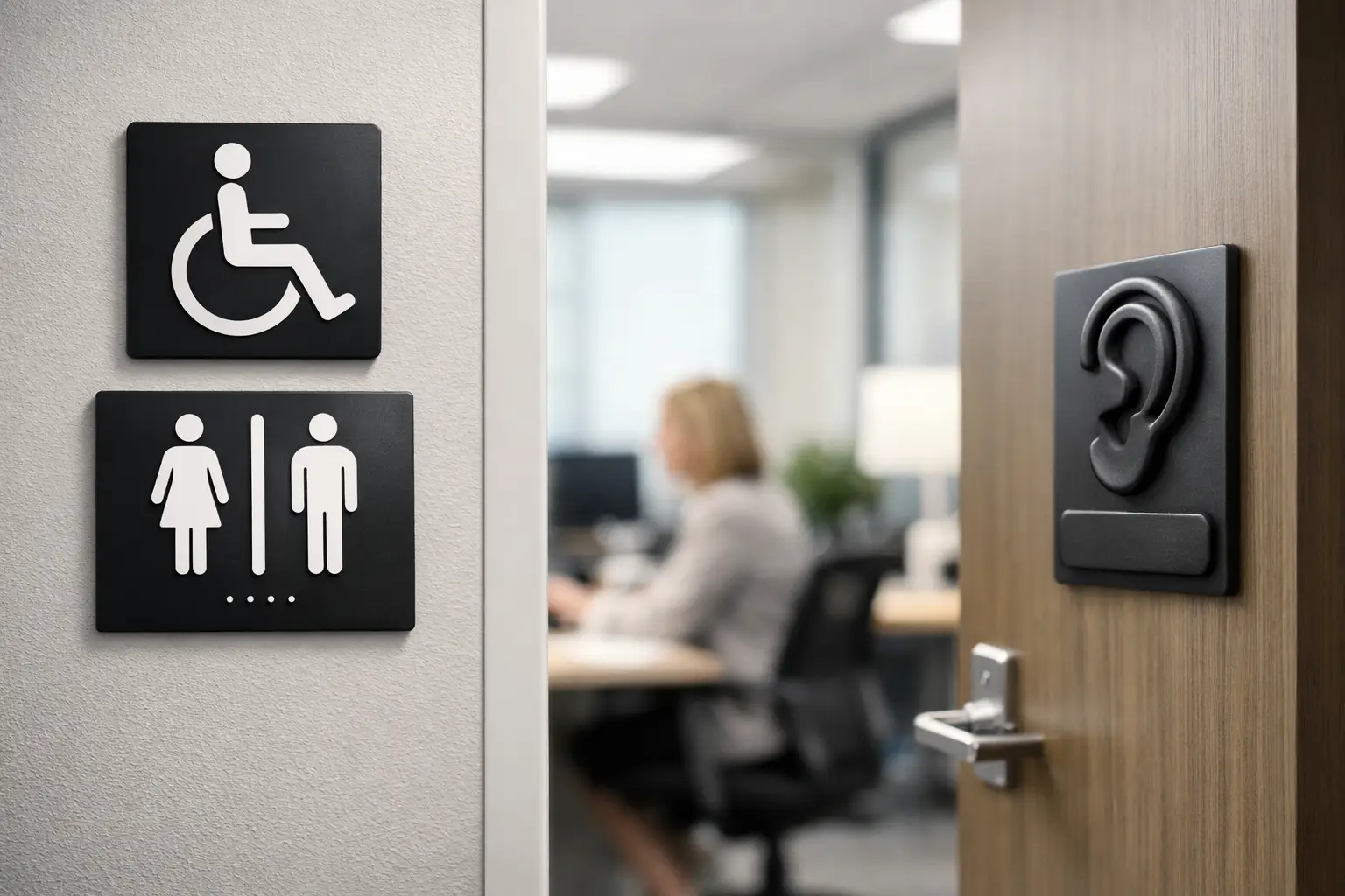
What counts as ADA office signage
Not every sign in an office has to meet ADA tactile requirements. That is where many buyers get tripped up. ADA rules typically apply to signs that identify permanent rooms and spaces. Think restrooms, exits, stairwells, room numbers, offices, conference rooms, electrical rooms, and other permanent areas.
A promotional wall graphic is different. A temporary paper notice taped to a door is different. A directional sign in a lobby may follow other standards depending on its purpose and placement. The details matter, and this is where one-size-fits-all advice can create expensive mistakes.
In practical terms, offices often need a package rather than a single sign. That package may include restroom signs, room ID signs, directional signs, directories, stair and exit signage, and branded interior signs that visually match the rest of the environment. The compliance side and the branding side should work together.
The features that make an ADA sign compliant
If you are buying ADA signs for offices, the visual style is only one piece of the job. The technical standards matter just as much.
Raised characters are a core requirement for many room identification signs. Braille is another. Letter height, stroke, spacing, finish, mounting height, and contrast all come into play. The sign also needs to be installed in the correct location, not just fabricated correctly. A compliant sign in the wrong spot can still create a problem.
Contrast is one area where design teams sometimes push too far. A sleek gray-on-gray look may fit a modern office aesthetic, but if readability drops, it is the wrong choice. ADA signage needs to be legible first. Good design works inside that constraint instead of fighting it.
Material choice matters too. Acrylic, photopolymer, metal, and layered substrates can all work, but the right option depends on the setting. A medical office with constant cleaning has different needs than a low-traffic administrative suite. Durability, maintenance, and finish should be part of the conversation early.
Common mistakes office managers make
The biggest mistake is waiting too long. ADA signage often gets treated like the final item on a punch list, ordered after walls are painted and furniture is installed. That creates delays and rushed decisions.
The second mistake is assuming every interior sign needs the same treatment. It does not. Some signs need tactile copy and Braille. Others are directional. Others are purely decorative or branded. If you overbuild, you waste budget. If you underbuild, you risk noncompliance.
Another common issue is inconsistency. Offices that grow over time often end up with signs from three different vendors, three different fonts, and two different mounting styles. That patchwork look weakens the space. It also makes wayfinding harder, especially in shared office buildings and larger facilities.
Then there is installation. Even a well-made sign can fail in the field if it is mounted on the wrong side of a door, placed too high, or blocked by trim or hardware. Fabrication and installation should not be treated as separate afterthoughts.
How to plan ADA signage for a new office or renovation
The smartest time to think about ADA signage is during layout planning, not after construction wraps. Once room names, room numbers, traffic flow, and tenant needs are clear, the signage package becomes much easier to define.
Start with permanent spaces. Identify every room and area that requires a tactile sign. Then review circulation. Where do visitors hesitate, ask questions, or make wrong turns? That is where directional signs and directories carry real value.
After that, look at the full interior sign system. This is where practical buyers save time and money. Instead of sourcing ADA signs, lobby signs, window graphics, and directories through separate vendors, it usually makes more sense to treat them as one coordinated project. That keeps the design consistent and avoids schedule gaps.
For multi-tenant properties, this coordination matters even more. Shared directories, suite numbers, restroom identification, and common-area wayfinding need a unified logic. Otherwise the building feels harder to use than it should.
ADA signs and office branding can work together
Compliance does not mean boring. It means disciplined.
The best office sign systems use a clear visual hierarchy. The ADA room signs handle identification. The directories guide movement. The lobby sign builds first impression. Window graphics support privacy or brand presence. Each element does a different job, but they should still feel related.
That usually comes down to typography, color strategy, materials, and finish selection. A law office may want a refined brushed metal look. A pediatric clinic may need a warmer, more approachable palette. A coworking space may want something modern and minimal. There is room to express brand personality without compromising readability or code considerations.
This is especially valuable in competitive markets like New York City, where office interiors often need to feel polished from day one. Clients, patients, tenants, and employees read the environment quickly. Signage is part of that reading.
Choosing the right partner for office ADA signage
If you are comparing vendors, do not judge on unit price alone. Cheap signs become expensive when they arrive wrong, clash with the office design, or need to be remade because measurements or code details were missed.
A better standard is execution. Can the company help map the sign schedule, advise on materials, match the look to your interior, fabricate accurately, and install correctly? Can they handle a full package rather than just shipping plaques in a box?
For busy business owners and property managers, that matters more than a low upfront quote. The real value is having one partner who can move the job from concept to completion without forcing you to coordinate design revisions, code questions, production, and field install across multiple teams.
That is why many offices choose a full-service sign company instead of trying to piece the job together. In markets like Queens, Brooklyn, Manhattan, the Bronx, and Long Island, speed and coordination are often just as important as aesthetics.
When custom ADA signs make sense
Standard templates are fine for simple room labels. But many offices need custom work.
If your office has branded room names, specialty departments, multilingual visitors, premium interior finishes, or a nonstandard floor plan, custom signage usually delivers a better result. The key is making custom choices without drifting away from compliance or readability.
Custom also makes sense when your office is part of a larger refresh. If you are updating the lobby, repainting interiors, changing suite numbers, or reworking traffic flow, ADA signs should be folded into the broader plan. That avoids the common problem of new interiors paired with outdated room plaques.
A strong signage partner can help balance code requirements, design goals, and budget. That balance is where the best projects happen.
ADA signage is not the flashy part of an office buildout, but it has an outsized effect on how the space works. When the signs are right, people move easier, staff answer fewer repetitive questions, and the office feels finished. If you are planning a new space or fixing a scattered sign system, handle the ADA pieces early and handle them with intention. It is one of the simplest ways to make the entire office perform better.