A storefront gets judged fast. Before a customer reads your menu, checks your hours, or steps through the door, they see your sign. That is why channel letter signs remain one of the smartest investments for businesses that want stronger visibility, better curb appeal, and a more established brand presence.
If you run a retail store, restaurant, medical office, church, school, or commercial property, your sign has one job first – get noticed. But the best signs do more than grab attention. They create confidence. A clean, well-built set of channel letters tells people your business is open, professional, and worth walking into.
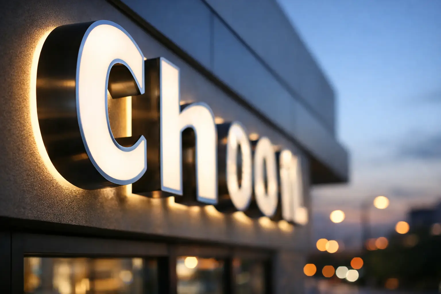
What channel letter signs actually are
Channel letter signs are custom-made, three-dimensional letters that are usually mounted on a building exterior. Each letter is individually fabricated, often from aluminum and acrylic, and can be illuminated or non-illuminated depending on the look you want and the visibility you need.
This style is popular for a reason. It gives businesses a polished, high-end appearance without feeling overdesigned. You can keep it simple with front-lit letters in your brand colors, or create a more refined look with halo-lit letters that cast light behind the lettering. Either way, the result is clean, readable branding that works from a distance.
For many businesses, this is the sign format that bridges branding and performance. It looks custom because it is custom, but it also solves a practical problem – helping customers find you quickly.
Why channel letter signs work so well
A flat sign panel can still be effective, but channel letters bring depth, light, and presence to a building facade. That extra dimension matters, especially in crowded commercial areas where every storefront is fighting for attention.
The main advantage is visibility. Illuminated letters stay readable in the evening, during bad weather, and in high-traffic areas where passing drivers and pedestrians only have a few seconds to process what they see. If your business operates early, late, or both, lighting is not a luxury. It is part of being easy to find.
There is also a credibility factor. A professionally fabricated letter set tends to signal permanence. People may not consciously think about material quality, mounting methods, or illumination style, but they do notice whether a sign looks sharp or looks temporary. That first impression affects how they view the business behind it.
Then there is flexibility. Channel letters can be scaled for a small boutique or a large shopping center tenant. They can match strict brand guidelines for a franchise or be fully custom for an independent business. That range is one reason they are so widely used across industries.
Choosing the right style for your business
Not all channel letter signs look the same, and that is where strategy matters. The right choice depends on your location, brand personality, building conditions, local regulations, and budget.
Front-lit channel letters are the most common option. They have acrylic faces that illuminate from within, making them bright and easy to read. This is a strong fit for restaurants, retail businesses, laundromats, and service brands that want straightforward visibility.
Halo-lit letters, also called reverse channel letters, create a softer glow behind each letter. They often feel more upscale and architectural, which makes them a strong choice for office buildings, medical practices, salons, and professional firms. They can look excellent, but they are not always the best option if maximum brightness is the top priority.
Open-face channel letters have exposed lighting and a more classic, energetic character. They are often used by restaurants, bars, and entertainment venues. They can be highly distinctive, but they are also a more specific aesthetic choice. If your brand leans clean and modern, another format may fit better.
Non-illuminated letters can still work in the right setting. If your storefront has strong daytime traffic and no evening hours, you may not need lighting. But in many cases, business owners regret going too minimal once they see how much visibility drops after sunset.
Design decisions that affect results
A sign can be custom without being effective. Good design is not about adding more. It is about making smart decisions that improve readability and brand recognition.
Letter height matters more than many people expect. So does stroke width, spacing, and color contrast against the building facade. A beautiful script font may look great on a business card but fail completely on a sign viewed from across the street. The same goes for low-contrast color combinations that disappear against brick, stucco, or dark panels.
This is where experience pays off. The best sign designs account for viewing distance, traffic speed, line of sight, and architectural surroundings. A sign for a busy avenue in Queens may need a different approach than a sign inside a quieter retail plaza on Long Island. One size does not fit all.
Mounting style also changes the final look. Raceway-mounted letters are attached to a narrow box that houses wiring, which can simplify installation and reduce wall penetrations. Direct-mounted letters create a cleaner appearance, but installation may be more involved. Neither option is automatically better. It depends on the building and the priorities of the project.
What business owners often overlook
The sign itself is only part of the job. Permits, code compliance, electrical access, landlord approvals, and installation logistics can slow down a project if they are not handled correctly from the start.
That is why many business owners prefer a full-service sign partner instead of hiring separate designers, fabricators, and installers. A good sign company does not just make the letters. It helps you avoid delays, flag potential issues early, and move the job from concept to installation without constant back-and-forth.
In New York City especially, this matters. Building conditions vary. Municipal requirements vary. Landlords and property managers often have their own standards. If your provider is not organized, your timeline can get pushed for reasons that have nothing to do with fabrication quality.
The stronger approach is simple – get the design right, confirm the scope, handle approvals, fabricate accurately, and install professionally. That is how you keep a sign project from turning into a distraction.
Are channel letter signs worth the investment?
For most storefront businesses, yes. But the real answer depends on what the sign needs to do.
If you need a temporary promotional sign, channel letters are probably not the right tool. If you are testing a concept in a short-term lease, a lower-cost sign option may make more sense. But if you are building a serious brand presence, upgrading a dated storefront, or opening a location that needs to attract walk-in traffic, channel letters usually deliver strong long-term value.
They are durable, highly visible, and custom to your brand. More importantly, they work every day without asking customers to do anything extra. No ad spend. No click-through rate. Just a physical brand asset doing its job around the clock.
That does not mean every project should be oversized or premium in every category. Smart budgeting still matters. Sometimes the best move is a clean, front-lit letter set with efficient materials and a straightforward install. Sometimes it is worth spending more for a stronger architectural look. The right answer depends on the building, the audience, and how central foot traffic is to your revenue.
Getting the project right from day one
The most successful sign projects start with clear goals. Do you need stronger visibility from the street? Better nighttime presence? A sign that aligns with franchise rules? A more polished image for a property or office? Once that is clear, the design and fabrication choices become easier.
It also helps to work with a team that can guide the full process. 10X Sign Company handles custom sign fabrication, design support, installation, and project execution for businesses that want results without chasing multiple vendors. That kind of coordination saves time and usually leads to a cleaner final product.
A channel letter sign should not feel like a gamble. It should feel like a planned upgrade to your business presence.
When customers look at your building, they should know you are established, visible, and ready for business. If your current sign is fading into the background, this is the kind of change people notice right away.