A storefront on a busy Queens block gets only a few seconds to make an impression. If your sign is hard to read, poorly placed, or disconnected from your brand, people keep walking. The best outdoor business signage ideas do one thing well – they make your business easier to notice, easier to trust, and easier to choose.
For New York City businesses, that matters more than most. You are competing with traffic, visual clutter, neighboring storefronts, and customers who make fast decisions. Good signage is not decoration. It is a sales tool, a locator, and a brand signal working at street level every day.
What makes outdoor business signage ideas actually effective
A sign can look impressive and still underperform. That usually happens when business owners focus only on style and ignore visibility, scale, lighting, and placement. The strongest sign programs balance all four.
Visibility starts with readability. Drivers, pedestrians, and people across the street need to understand what you are, not guess. That means the right letter height, enough contrast, and a layout that does not bury the message. If your business name is elegant but impossible to read from 30 feet away, the design is costing you traffic.
Placement matters just as much. In dense NYC corridors, a front-facing sign may not be enough. Blade signs, projecting signs, window graphics, and awnings can work together so your business is visible from multiple angles. That is often the difference between a location that blends in and one that gets noticed.
Then there is durability. Outdoor signage in New York deals with sun, rain, grime, wind, and wear. Materials, finishes, and installation methods need to match the environment. Cheap fabrication may look acceptable on day one and tired by month six.
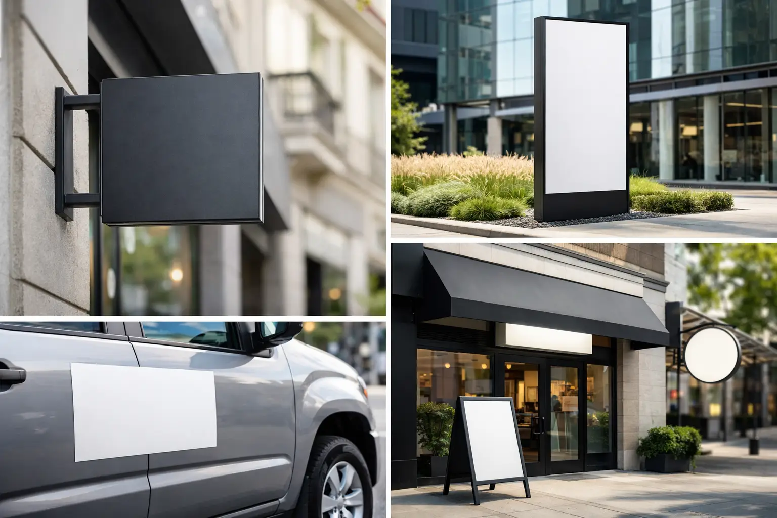
11 outdoor business signage ideas for stronger street presence
1. Channel letter signs for premium visibility
Channel letters are one of the most effective choices for retail stores, medical offices, restaurants, and franchises. They give your brand a clean, dimensional look and can be illuminated for day and night visibility.
This option works especially well when your business needs a polished, established appearance. Front-lit letters are bright and direct. Halo-lit letters feel more upscale. Non-illuminated letters can still work if your block gets strong daytime traffic, but in many commercial areas, lighting earns its keep.
2. Blade signs for foot traffic corridors
If your location depends on pedestrians, blade signs deserve serious consideration. Mounted perpendicular to the building, they help people spot your business before they are directly in front of it.
This is especially useful on crowded retail strips in Brooklyn, Manhattan, and Queens where parked cars, tree cover, and neighboring signs compete for attention. A blade sign extends your visibility line and helps guide foot traffic toward your entrance.
3. Awning signs that combine branding and function
An awning does more than add shade. It creates a clear branded presence, frames your storefront, and can make a business look more established.
For restaurants, salons, laundromats, and neighborhood shops, awning signage often delivers both aesthetics and utility. The trade-off is that design discipline matters. A cluttered awning with too much text can look dated fast. Keep the message focused and let the structure do some of the visual work.
4. Monument signs for properties with setback
If your building sits back from the road, a wall sign alone will not carry the load. Monument signs solve that problem by putting your name closer to street level where drivers can actually see it.
They are a strong fit for schools, churches, medical buildings, business parks, multifamily properties, and standalone commercial sites. They also communicate permanence. When designed well, they give a property a more credible and organized appearance from the street.
5. Light box signs for bold, simple messaging
Light box signs remain a practical choice for many businesses because they are bright, direct, and readable from a distance. They work well for delis, takeout spots, convenience stores, service businesses, and storefronts with long operating hours.
The key is restraint. A light box packed with too many colors or design elements can feel generic. A clean layout with strong typography usually performs better than a busier concept trying to say too much.
6. Window graphics to support the main sign
Window graphics are often overlooked in conversations about outdoor business signage ideas, but they can add real value. They reinforce branding, display services, promote seasonal offers, and make underused glass work harder.
They are especially effective when your main exterior sign identifies the business and your windows handle supporting information. That split keeps the storefront cleaner and easier to understand. For first-time sign buyers, this is often one of the most cost-effective upgrades available.
7. Large banners for openings and promotions
Not every sign has to be permanent. Large outdoor banners are ideal for grand openings, limited-time promotions, construction wraps, school events, church programs, and seasonal campaigns.
Banners are flexible and fast, but they should not look temporary unless that is the point. Proper finishing, sizing, and installation make a major difference. A wrinkled or poorly secured banner weakens your image. A well-produced one creates urgency without sacrificing professionalism.
8. Post and panel signs for property direction
For property managers, schools, churches, and community facilities, post and panel signs are a reliable option for identification and direction. They help visitors find entrances, parking areas, offices, and specific buildings without confusion.
These signs are not flashy, and that is exactly why they work. Clear information in the right place reduces friction for customers, tenants, guests, and staff.
9. Directory and wayfinding signs outside the building
If people arrive at your property and still do not know where to go, your signage system is incomplete. Exterior directory and wayfinding signs are critical for campuses, medical plazas, office complexes, schools, and multi-tenant buildings.
This is where strategy matters more than decoration. Every directional sign should answer a simple question at the moment it appears. Too much information creates hesitation. Clear arrows, consistent naming, and logical placement keep the experience smooth.
10. Dimensional lettering for a clean architectural look
Some brands do not want the bright look of a light box or the standard feel of flat panels. Dimensional letters offer a sharper architectural appearance while still creating depth and presence.
This is a strong option for professional offices, high-end retail, property identification, and modern storefronts. It works best when the building facade already has character and the sign is meant to complement the architecture rather than dominate it.
11. Multi-sign combinations for maximum impact
In many cases, the best answer is not one sign. It is a coordinated set. A channel letter sign paired with window graphics and a blade sign can outperform any single element on its own.
That is because customers approach from different directions and distances. They may first see your business from down the block, then from the sidewalk, then at the door. A layered signage approach supports every step of that path and creates a stronger brand impression overall.
How to choose the right outdoor business signage ideas for your location
Start with how people find you. If most customers walk by, invest in signs visible from the sidewalk and from an angle. If they drive in, prioritize readability from a distance and at speed. If your property is large or multi-tenant, direction matters as much as branding.
Then consider your building type. A street retail storefront needs a different sign strategy than a medical office in a plaza or a school campus with several entrances. Your ideal sign is not the one that looked great on another property. It is the one that solves your visibility problem on your site.
Budget matters, but value matters more. A less expensive sign that underperforms is not a savings. In many cases, spending more on better materials, illumination, or professional installation creates a stronger return because the sign keeps working longer and presents your business more credibly.
Compliance also needs to be part of the conversation early. In NYC, sign projects can involve building requirements, landlord rules, size limitations, and permitting considerations. That is one reason many business owners prefer a full-service partner that can handle design, fabrication, and installation without making them manage every moving part themselves.
Why execution matters as much as the idea
A strong concept can still fail if fabrication is weak or installation is rushed. Colors can shift. Materials can age poorly. Mounting can look uneven. Lighting can create hot spots. These details shape how customers judge your business before they ever speak to your team.
That is why the process matters. The right sign partner helps you narrow the format, align it with your brand, account for the site conditions, and produce something built for real-world performance. For business owners across NYC, speed matters, but so does getting it right the first time.
At 10X Sign Company, we see the difference every day between signage that simply fills space and signage that produces results. The best outdoor sign is not the trendiest option. It is the one that gets your business seen, understood, and remembered by the right people.
If you are weighing outdoor business signage ideas, start with what your customers need to notice first. That one decision usually points you toward the sign that will do the job.