At street level, your sign has a split second to do its job. That is why the choice between channel letters vs light box matters more than most business owners expect. The right sign can make your location easier to find, strengthen your brand, and help your storefront look established before a customer ever walks in.
This decision is not really about which sign type is better in the abstract. It is about which one fits your business, your building, your budget, and the kind of impression you want to make. A busy retail corridor in Queens may call for one approach, while a medical office, school, church, or strip mall tenant may benefit from another.
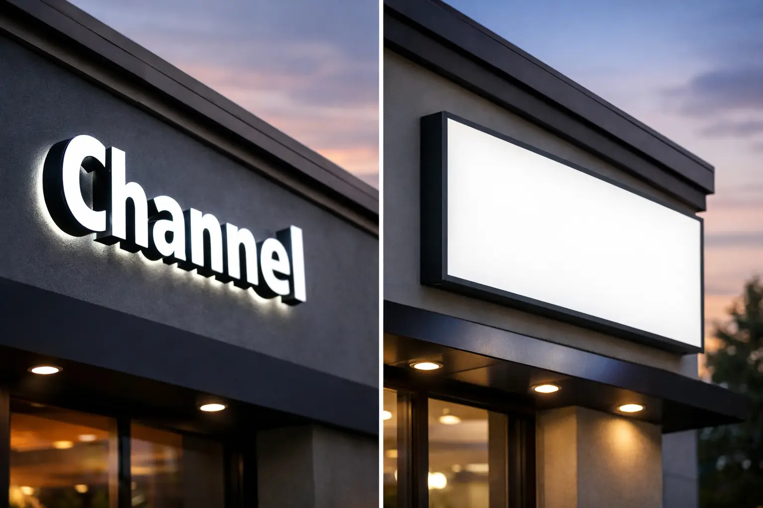
Channel letters vs light box: the real difference
Channel letters are individually fabricated letters, usually illuminated, mounted directly to a building facade or raceway. Each letter has its own shape and depth, which gives the sign dimension and a more custom appearance. If you want your business name to feel premium, architectural, and brand-forward, channel letters usually lead the conversation.
A light box sign, sometimes called a cabinet sign, is a framed box with an illuminated face panel. Your logo, name, or message is applied to the face, and the entire panel lights up. It is a practical, highly visible format that works well when readability and value matter most.
The difference is visual, but it is also strategic. Channel letters tend to emphasize brand presentation. Light boxes tend to emphasize broad visibility and cost efficiency. That does not mean the choice is simple. Plenty of businesses need both goals at once.
When channel letters make more sense
Channel letters are often the stronger choice when appearance is doing heavy lifting for the business. Restaurants, salons, dental offices, retail stores, fitness studios, and professional offices often choose them because they look clean, modern, and intentional.
There is a reason they are common on higher-end storefronts. The three-dimensional look creates shadow, depth, and separation from the wall even during the day when the sign is not lit. At night, illumination can be crisp and refined rather than broad and flat. If your logo has a distinct typeface or icon, channel letters usually preserve that identity better than a cabinet face.
They also help when you want your sign to feel built into the property rather than attached as an afterthought. For landlords and property managers, that can matter. For franchise operators, brand standards often push the decision in this direction too.
That said, channel letters are not automatically the right move for every site. They can cost more upfront because fabrication is more customized. Installation can also be more involved depending on the wall surface, electrical access, and local permitting requirements.
When a light box sign is the better choice
Light box signs earn their place because they work. They are straightforward, bold, and often easier to read from a distance. If your primary goal is to get noticed fast by foot traffic or passing vehicles, a well-designed cabinet sign can do that very effectively.
They also make sense for businesses that need more than just a name. If you want to include a logo, tagline, service line, or multiple graphic elements in one illuminated display, a light box gives you more face area to work with. Laundromats, delis, convenience stores, auto-related businesses, schools, churches, and neighborhood service providers often benefit from that extra visual room.
Budget is another factor. In many cases, a light box can be the more economical path to an illuminated storefront sign, especially for small businesses that need strong visibility without stretching the project too far. If you are opening a new location and balancing rent, buildout, permits, printing, and marketing, that matters.
The trade-off is style. A light box can look more utilitarian if it is not designed well. The sign face, frame, color choices, and proportions all matter. Done right, it can still look sharp and professional. Done poorly, it can feel generic.
Cost, maintenance, and long-term value
If you are comparing channel letters vs light box signs strictly on price, light boxes often come in lower. They are typically simpler to fabricate as one cabinet rather than multiple individual letters. But sticker price is only one part of the decision.
Channel letters can deliver stronger branding value over time. If the sign makes your storefront look more credible, more established, and more aligned with your brand, that return shows up in perception as much as in visibility. Businesses in competitive areas often care about that edge.
Maintenance is also worth thinking about before you buy. A cabinet sign has one main structure and one face, which can simplify service in some cases. Channel letters have more individual components, but modern LED systems are reliable, and serviceable letter-by-letter construction can be an advantage when only one section needs attention.
This is where it pays to work with a sign partner that handles fabrication and installation with the long view in mind. Material quality, LED selection, access planning, and proper mounting affect how the sign performs years later, not just how it looks on install day.
Which sign performs better in daylight and at night?
In daylight, channel letters often have the stronger visual presence because of their dimensional build. They read like an architectural feature. Even when the lights are off, they can still look substantial and polished.
At night, both can perform well, but they do it differently. Channel letters create a more refined illuminated effect. Light boxes create a larger, more uniform glow. If your storefront competes with a lot of visual noise, a cabinet sign may cut through more aggressively. If your business depends on a more upscale or design-conscious impression, channel letters often win.
There is also the issue of viewing distance. From farther away, a light box can be easier to identify because the entire panel is illuminated. From closer range, channel letters tend to feel more premium and memorable.
Brand image matters more than people think
A sign is not just identification. It signals what customers should expect from the business behind it. That is why the channel letters vs light box conversation should include brand positioning, not just fabrication style.
If you run a medical practice, a law office, a boutique, or a restaurant with a carefully developed interior, channel letters may better match that level of presentation. If you run a value-driven neighborhood business where fast recognition matters most, a light box may be the smarter call.
Neither choice is inherently more professional. What matters is whether the sign supports the type of trust you need to build. A polished cabinet sign can absolutely be the right move. A poorly planned set of channel letters can still miss the mark.
Building rules, landlord standards, and local approvals
A lot of sign decisions get made by practical constraints. Your lease, shopping center rules, building facade, and local sign code may narrow your options quickly. Some properties prefer channel letters for aesthetic consistency. Others are already designed around cabinet signage.
This is especially common in multi-tenant buildings and retail strips. A business owner may want one sign type, only to find the landlord requires another. That is not unusual. It is also why signage works best when design, code review, fabrication, and installation are handled as one coordinated process instead of separate steps.
For businesses in New York City and nearby markets, details like mounting surfaces, electrical runs, visibility angles, and permit requirements can shape the recommendation just as much as branding goals. The right answer on paper still has to work on the building.
So which one should you choose?
Choose channel letters if your priority is a more custom, dimensional, brand-led look and you want your storefront to feel elevated. Choose a light box if your priority is bold visibility, larger graphic space, and practical value.
If you are still torn, ask a simpler question: does your sign need to sell image first, or visibility first? That usually clarifies the direction.
For some businesses, the smartest move is not choosing based on preference at all. It is choosing based on site conditions, customer traffic, brand style, and what the sign needs to accomplish in the first three seconds someone sees it. That is where an experienced sign company brings real value – not by pushing one format, but by helping you make the right call and executing it cleanly.
A storefront sign should do more than fill a space above your door. It should work hard, look right, and give people one more reason to walk in.