A blank front window in a busy retail corridor is wasted real estate. People are already walking or driving past your business every day. The question is whether your glass is helping you win attention, explain what you do, and bring people inside. Done right, window graphics for storefront locations turn unused space into a 24/7 sales tool.
For business owners, this is not just a design choice. It affects foot traffic, privacy, seasonal promotions, and the way your brand is judged before a customer ever opens the door. In a place as competitive as New York, first impressions happen fast. Your storefront needs to communicate fast too.
Why window graphics matter more than most owners expect
Storefront windows sit at eye level, which makes them one of the most valuable branding surfaces you have. A sign above the door can identify your business, but window graphics can do more. They can highlight products, show business hours, reinforce your brand colors, add visual energy, and reduce the awkward feeling of looking into an empty or unfinished space.
They also help shape perception. A clean, well-designed window tells people your business is active, professional, and established. A cluttered or fading graphic does the opposite. Customers notice those details, even if they never say it out loud.
There is also a practical side. Some businesses need more privacy without blocking all natural light. Others need temporary promotional space that can change with a season, sale, or event. Window graphics solve both problems without the cost and permanence of structural changes.
The best window graphics for storefront use depend on the goal
This is where many businesses go wrong. They ask what type of graphic looks best, when the better question is what the window needs to do.
If your main goal is visibility from the street, bold branding and high-contrast lettering usually matter more than decorative detail. If your issue is privacy, frosted vinyl or perforated film may be the better fit. If you run promotions often, removable graphics make more sense than long-term installations.
A restaurant may want appetizing visuals and hours posted clearly near the entrance. A dental office may want privacy in treatment-facing windows while keeping a polished, calm look from outside. A boutique may lean into full-window graphics during a launch, then scale back to cleaner branding once the promotion ends. Same material category, different business result.
That is why strategy comes first. The graphic should support the way your business operates, not just fill up glass.
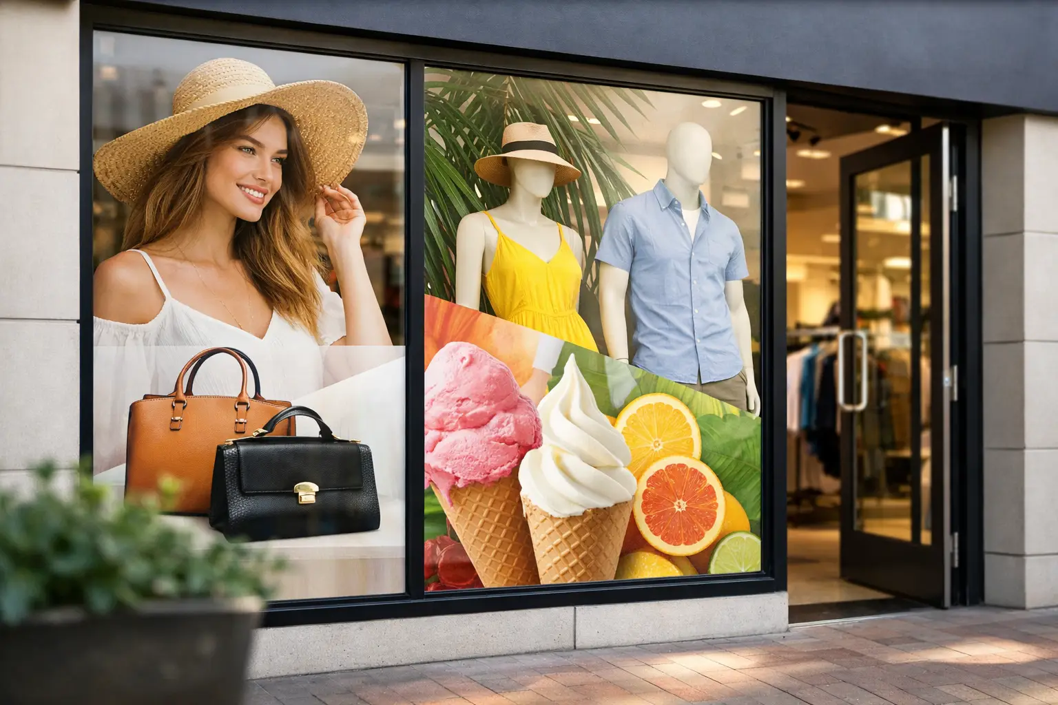
Common types of storefront window graphics
Full coverage graphics make a strong statement. These are ideal when you want maximum branding impact or need to block the view into the space. They work well for vacant retail buildouts, grand openings, and businesses that want to create a high-energy visual presence.
Partial window graphics offer more flexibility. You can keep part of the glass open while still displaying logos, messaging, product photos, or promotional offers. This approach often feels cleaner and works well for retail, offices, salons, and service businesses.
Perforated window film is popular because it lets people inside see out while presenting a printed image to the outside. It is useful, but not perfect for every window. Lighting conditions matter. If the interior is much brighter than the exterior, the one-way effect can be reduced.
Frosted and etched-look vinyl is a strong choice for privacy and professionalism. It is common in offices, medical spaces, schools, churches, and conference rooms that face public areas. It gives a refined look without making the window feel heavy or closed off.
Cut vinyl lettering is simple, durable, and effective for business names, hours, phone numbers, and clean brand messaging. It does not carry the visual punch of a full graphic, but it stays readable and works especially well when you want a minimalist storefront.
What makes a storefront graphic actually work
Good storefront graphics are not crowded. They are clear from a distance and readable in seconds. Most people passing your business will not stop to study a wall of text. They will notice a strong logo, a short message, a clear offer, and a design that feels intentional.
That means hierarchy matters. Your business name or category should be obvious first. Then your offer, atmosphere, or callout. Then practical details like hours or contact information if needed. If everything is large, nothing stands out.
Color matters too, but contrast matters more. The nicest brand palette in the world will not help if the text disappears against reflections, glare, or a dark interior. Window graphics live in changing light. Morning sun, cloudy afternoons, headlights at night, and shadows from neighboring buildings all affect readability.
Installation quality matters just as much as design. Even a strong graphic loses impact if edges lift, bubbles show, or panels are misaligned. Business owners usually do not want to think about installation details, but customers notice the final result immediately.
Mistakes that cost businesses foot traffic
The biggest mistake is saying too much. A storefront is not a brochure. If your windows list every service, every promotion, every social handle, and every design element at once, the message gets diluted. People keep walking.
The second mistake is ignoring the inside experience. Window graphics affect how a space feels from within. Too much coverage can make a business feel closed in. Too little privacy can make staff and customers uncomfortable. The right balance depends on the layout, lighting, and use of the space.
The third mistake is treating temporary graphics like permanent branding. A quick sale decal may be fine for a short campaign, but if it stays up too long, it starts to signal neglect. Storefront graphics need maintenance, updates, and occasional replacement if you want the business to keep looking sharp.
Another common issue is poor sizing. Graphics that are too small get lost. Graphics that are oversized without structure can feel aggressive or messy. Every storefront has different glass dimensions, framing, sightlines, and pedestrian traffic patterns. Custom planning beats guesswork every time.
How to plan window graphics for storefront success
Start with the customer view, not your internal wish list. Stand where people approach from each direction. What can they read from across the street? What do they notice from a parked car? What disappears in glare? These simple observations can save you from expensive revisions.
Next, decide what job the window should do first. Brand awareness, privacy, promotion, wayfinding, and decoration are not the same goal. You can combine them, but one should lead. That priority shapes the layout, materials, and coverage level.
Then think about lifespan. Are you branding a long-term location, promoting a three-week event, or covering windows during construction before opening? The right production method depends on how long the graphics need to perform and how often they will change.
This is where working with a full-service sign partner pays off. Design, material selection, print production, and installation all affect the outcome. When one team manages the process, there is less room for mismatch between concept and execution.
Local storefronts need practical solutions, not generic ones
In dense commercial areas like Queens, Brooklyn, Manhattan, the Bronx, and Long Island, storefront conditions vary fast. Some businesses deal with heavy foot traffic and close viewing angles. Others rely more on street visibility from passing cars. Some have beautiful natural light. Others fight reflections from neighboring buildings all day.
That is why generic templates usually fall short. A laundromat, medical office, quick-service restaurant, school, and boutique all need a different visual strategy, even if they are on the same block. The best results come from graphics that fit the space, the audience, and the pace of the location.
At 10X Sign Company, that is exactly how projects are approached – as business tools, not just printed vinyl. The goal is to help owners get a storefront that works harder from day one.
When it is time to update your storefront windows
If your graphics are peeling, faded, dated, or tied to an old offer, it is time. If people walk by without understanding what you sell, it is time. If your interior feels too exposed or too closed off, it is time.
A storefront should support sales, not create confusion. The right window treatment can sharpen your image, improve privacy, and give your location more energy without a full renovation. That makes it one of the smartest visual upgrades many businesses can make.
If you are investing in your location, make the glass count. Customers are already looking your way. Give them a reason to stop.