A visitor walks into your building, stops cold in the lobby, looks left, then right, then heads to the wrong hallway. That moment feels small, but it says a lot about your operation. Wayfinding signs for buildings do more than point people around. They reduce friction, protect your brand image, and help your space feel organized the second someone steps inside.
For property managers, office operators, schools, medical practices, churches, and retail centers, this is not a cosmetic detail. If people cannot find the front desk, elevator, suite number, restroom, or exit without asking for help, your building is working harder than it should. Staff get interrupted. Visitors get frustrated. Deliveries get delayed. In some settings, poor navigation can even create safety and accessibility problems.
Why wayfinding signs for buildings matter more than most owners expect
Good wayfinding is one of those things people notice only when it fails. When it works, the experience feels easy. Visitors move confidently. Tenants look more professional. Employees spend less time giving directions and more time doing their jobs.
That matters in a medical office where patients may already be stressed. It matters in a school where parents are rushing to the main office. It matters in a multi-tenant commercial property where each wrong turn chips away at the building’s perceived quality. Even in a smaller storefront or church campus, clear directional signage makes people feel welcome instead of unsure.
There is also a direct business case. Better navigation shortens check-in times, improves traffic flow, cuts down on missed appointments, and helps first-time visitors feel they are in the right place. If your building serves the public, that first impression has real value.
What effective building wayfinding actually includes
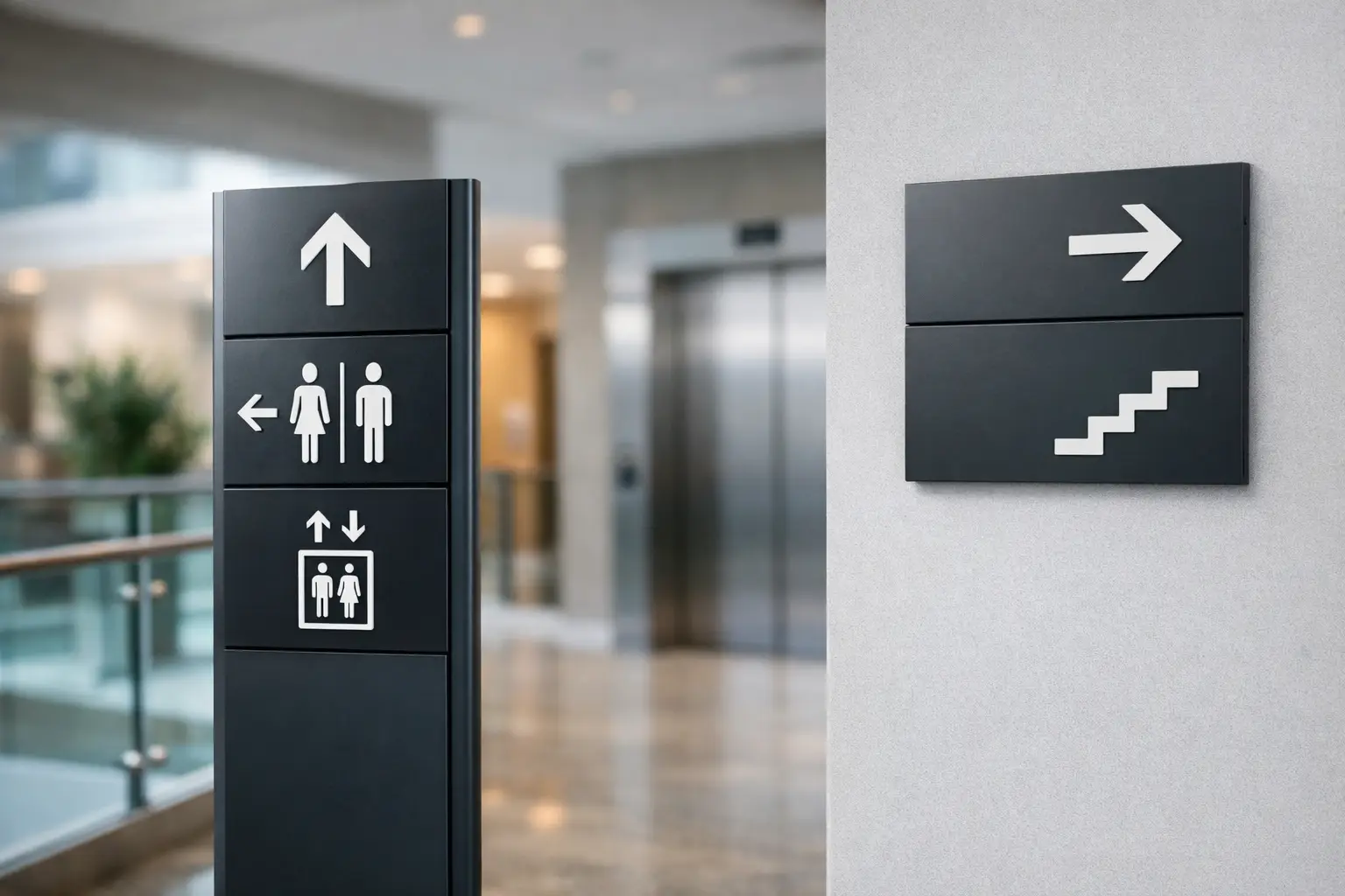
A lot of people hear “wayfinding” and picture a few arrows on the wall. In reality, a strong system is a connected set of signs that guide someone from arrival to destination without guesswork.
That usually starts outside. Parking signs, entrance identifiers, tenant panels, and directional markers set the path before a visitor even reaches the door. Once inside, the system continues with lobby directories, reception signs, floor identifiers, suite numbers, ADA signs, restroom signs, stairwell signs, and directional signs at key decision points.
The goal is not to flood the building with signs. Too many signs can be just as confusing as too few. The goal is to place the right information where a person naturally pauses and asks, where do I go next?
The best signs answer one question at a time
This is where many projects go off track. Owners try to fit every detail onto every sign. The result is clutter. A visitor walking through a hallway does not need a wall of text. They need a fast answer.
At the parking lot, they need to know where the visitor entrance is. In the lobby, they need to know which floor or suite they need. At the elevator, they need confirmation they are still on the right path. Effective signage breaks the journey into simple decisions.
Design matters, but clarity comes first
Branding should absolutely be part of the system. Colors, finishes, typography, and materials should match the look of the property or business. But readability comes first every time.
If the font is too stylized, the contrast is too low, or the sign blends into the wall, the sign fails no matter how attractive it looks. Clean type, strong contrast, consistent icons, and logical placement usually outperform trendy design choices. The strongest wayfinding systems look polished because they are clear, not because they are flashy.
Common mistakes that make buildings harder to navigate
The most common problem is inconsistency. One sign says “Reception,” another says “Front Desk,” and a third says “Main Office.” To the owner, these may feel interchangeable. To a visitor, they create doubt.
Placement is another frequent issue. A sign installed after a turn instead of before it forces people to backtrack. A directory mounted behind the entrance doors gets missed. Suite numbers that are too small or poorly lit slow people down, especially in older buildings or long corridors.
Then there is the issue of growth. Buildings change. Tenants move. Departments shift. Spaces get renovated. If your sign system is not planned for updates, the property starts collecting temporary paper notices, taped arrows, and patched-over panels. That visual clutter hurts credibility fast.
Accessibility cannot be an afterthought
For many facilities, ADA-compliant signage is a legal requirement, but it is also a practical standard for usability. Tactile characters, braille, mounting height, contrast, and pictograms all matter. This is especially important in offices, schools, medical facilities, apartment buildings, and public-facing properties.
Accessibility is not separate from wayfinding. It is part of it. A building that only works for some visitors is not fully working.
How to plan wayfinding signs for buildings the right way
The smartest way to approach wayfinding is to think like a first-time visitor, not like someone who already knows the space. Walk the property from the parking area, sidewalk, or main entrance. Notice every moment where a person has to choose a direction.
That path usually reveals the exact sign types you need. You may realize the problem starts outside, not in the lobby. Or that your directory is fine, but there is no confirmation signage when people step off the elevator. In many buildings, confusion comes from one or two missing links, not from a total lack of signage.
It also helps to think in layers. Exterior signs bring people to the right entrance. Interior directional signs move them through the building. Identification signs confirm they have arrived. Regulatory and ADA signs support safety and compliance. When these layers work together, the building feels easy to use.
Material and installation choices depend on the setting
There is no single best material for every property. Acrylic, aluminum, PVC, vinyl graphics, dimensional letters, and modular directory systems all have their place. A corporate lobby may call for polished interior signage with branded finishes. A school or high-traffic facility may need durable, easy-to-clean materials that can take wear. A multi-tenant office may benefit from a directory system that can be updated without replacing the full sign.
Installation matters just as much as fabrication. Even a well-designed sign can underperform if it is mounted at the wrong height, blocked by furniture, or placed in poor lighting. This is one reason many owners prefer a full-service sign partner instead of juggling design, production, and installation across separate vendors.
Where a professional sign partner changes the outcome
Wayfinding projects look simple from the outside, but they involve more decisions than most buyers expect. Messaging, hierarchy, materials, code considerations, ADA standards, branding, site conditions, and installation logistics all have to line up.
That is why the process matters. A strong sign company does not just print arrows. It helps map the visitor journey, identify gaps, recommend practical sign types, produce the system consistently, and install it where it will actually work. For busy owners and property teams, that saves time and prevents costly rework.
In a dense market like New York City, where buildings often have limited space, older layouts, mixed-use traffic, and fast-moving tenant needs, that planning becomes even more valuable. A clear system can make a compact or complicated property feel easier to use than a much larger building with poor signage.
10X Sign Company approaches projects with that full-lifecycle mindset, because clients usually do not need a sign vendor. They need a partner who can help turn a confusing space into a more professional, functional environment.
Better navigation creates a better brand experience
People judge your business long before the meeting starts or the sale happens. They judge it when they try to find parking, enter the right door, locate the elevator, and figure out whether they are in the right suite. Wayfinding influences that entire experience.
When the signage is clear, your building feels managed. It feels credible. It feels ready for business. That matters whether you run a dental office, manage a church campus, lease commercial space, or operate a school with multiple departments.
If your visitors are hesitating, asking for directions, or wandering the halls, your building is telling you something. Fixing that does not always require a major overhaul. Sometimes it takes a smarter system, better placement, and signage designed for real human behavior. Get that right, and your building starts working for people the moment they arrive.